February 11, 2020
Stunning Bouquets to Celebrate Pantone’s Color of The Year

Sooner than we could purchase our new calendars, we were hit with internet shaking trends sure to make a lasting impression! From streaming revolutions to holistic home decor, trend-setters hit the ground running ready to make a splash in the new decade. One of our favorite announcements, however, was from the kings of influence and design, The Pantone Institute announcing their annual Color of the Year!
What is Pantone’s Color of the Year?
This year, the color selected was Viva Magenta. Described as "a shade rooted in nature descending from the red family and expressive of a new signal of strength. Viva Magenta is brave and fearless, and a pulsating color whose exuberance promotes a joyous and optimistic celebration, writing a new narrative."
Established in 1963, the Pantone Color Institute began as a graphic standards system and has evolved into a collective that strives to be the universal language of color. Pantone also highlights the top seasonal runway colors, forecasts global color trends and advises companies on color for product and brand visual identity.
About Pantone Color of the Year
The Pantone Institute ensures its selection is reflective of macro trends that are taking place in culture. Influences include art, media, movies, lifestyles, socioeconomic and political conditions, travel destinations, and new technology. The vice president of the Pantone Color Institute, Laurie Pressman describes it as a “color that anticipates what’s going to happen next” as we enter into a new decade.
To share further meaning behind Classic Blue, Executive Director of the Pantone Color Institute Leatrice Eiseman announced that “we are living in a time that requires faith and trust and is a kind of consistency that the solid, dependable Classic Blue expresses”. Classic Blue encourages viewers to look beyond the obvious, expand their thinking, increase their perspective and engage in an open stream of communication.
Connect with Classic Blue
Pantone’s Color of the Year is not only meant to be consumed visually but also through the other sensory vehicles. Think taste, smell and touch! The color is meant to instill calmness, confidence, and connection. Classic Blue was selected as it brings a sense of peace and tranquility to the human spirit, offering refuge and clarity to our psyche. As science has shown us, colors have an impact on our emotions and well-being and the color blue is associated with feelings of calmness and serenity.
In order to reap the benefits of Classic Blue we incorporate shades into our home and everyday environments. Why stop there! Adding Classic Blue hues to common objects like foods and flowers can also allow us to experience the benefits of this color through all of our senses.
Pantone Color Harmonies
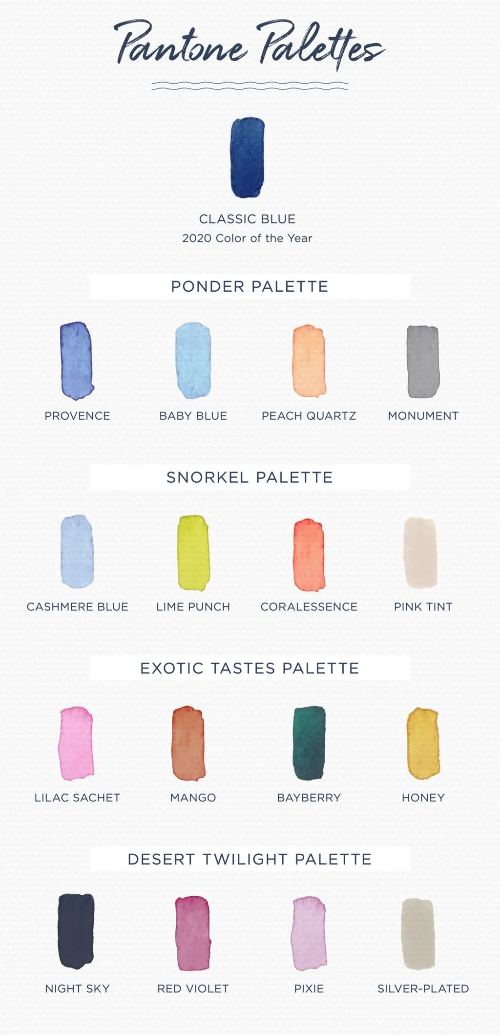
To encourage styling Classic Blue, Pantone provided color harmonies to help designers and regular folks like us explore palettes and utilize the Color of the Year into their craft. These color harmonies mix cool hues with dramatic shades to push the boundaries of design and tap into the psychology of color.
Whatever the occasion, use our helpful guide to incorporate The Color of the Year Into your floral arrangements. For inspiration and styling tips we’ve sourced the top floral bouquets using Pantone’s color harmonies to help you celebrate Classic Blue and pick a bouquet that speaks to you! Say hello to 2023 by celebrating Pantone’s Color of the Year with these beautiful arrangements!
Experience Tranquility with These Tones
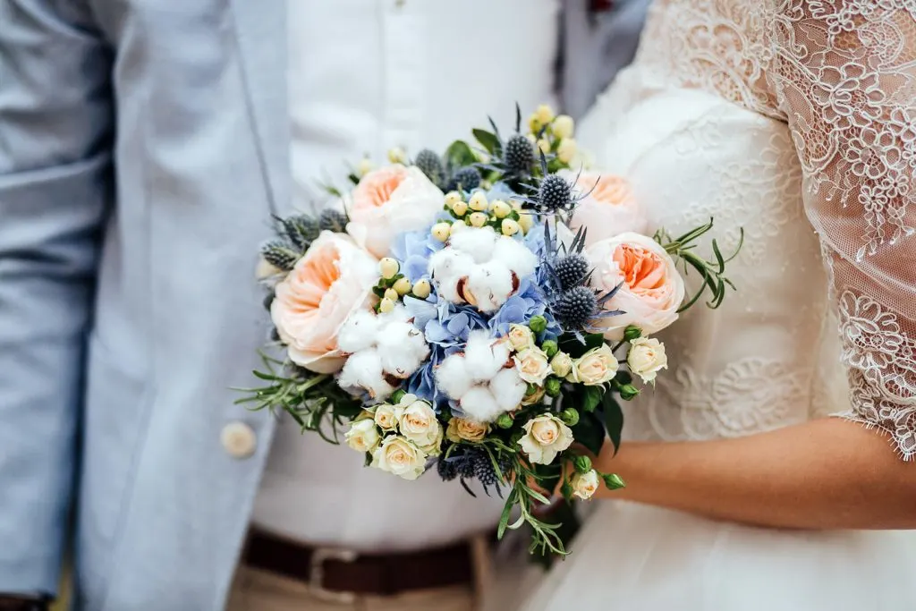
Explore the first color harmony Ponder’ by using Classic Blue among cool shades of grey and warmer shades of peach. This combination will create a calming effect and add balance to the human spirit.
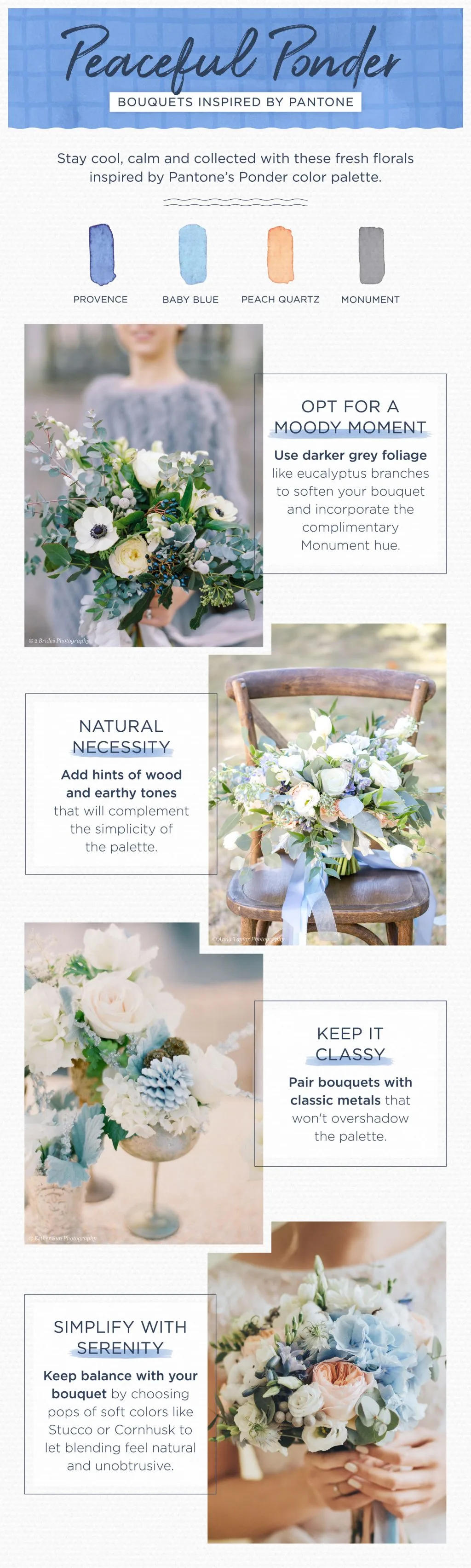
2 Brides Photography | Anna Taylor Photography | Esther Sun Photography
Enjoy a Palette of Paradise
For a more whimsical color harmony, Snorkel incorporates vibrant colors like Coralessence and Jasmine Green to playfully tease the eye. This color harmony was selected to transport viewers to an idyllic destination of paradise and natural bliss.
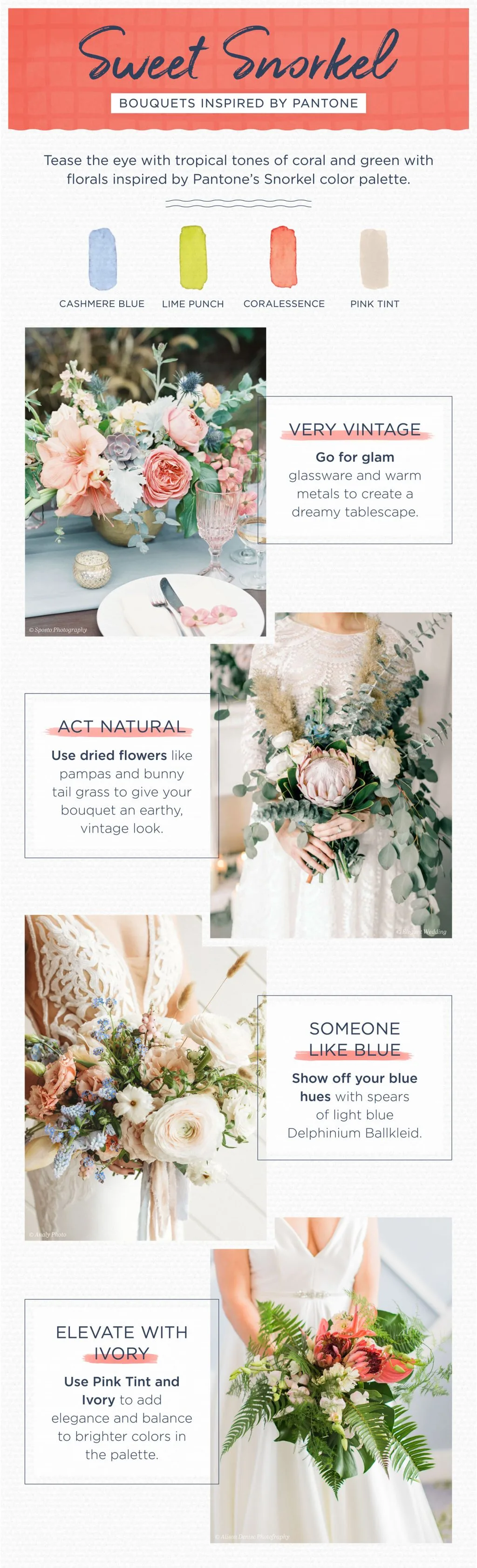
Sposto Photography | @lavendersflowers | Elegant Wedding | Analy Photo | Alison Denise
Settle on Shades that Shimmer
The Desert Twilight color harmony brings a level of romanticism to any event as being suggestive of the early evening sky and mystery. Mixed metal colors add a glittery grouping to this palette to mimic the sophistication and illumination of the night sky.
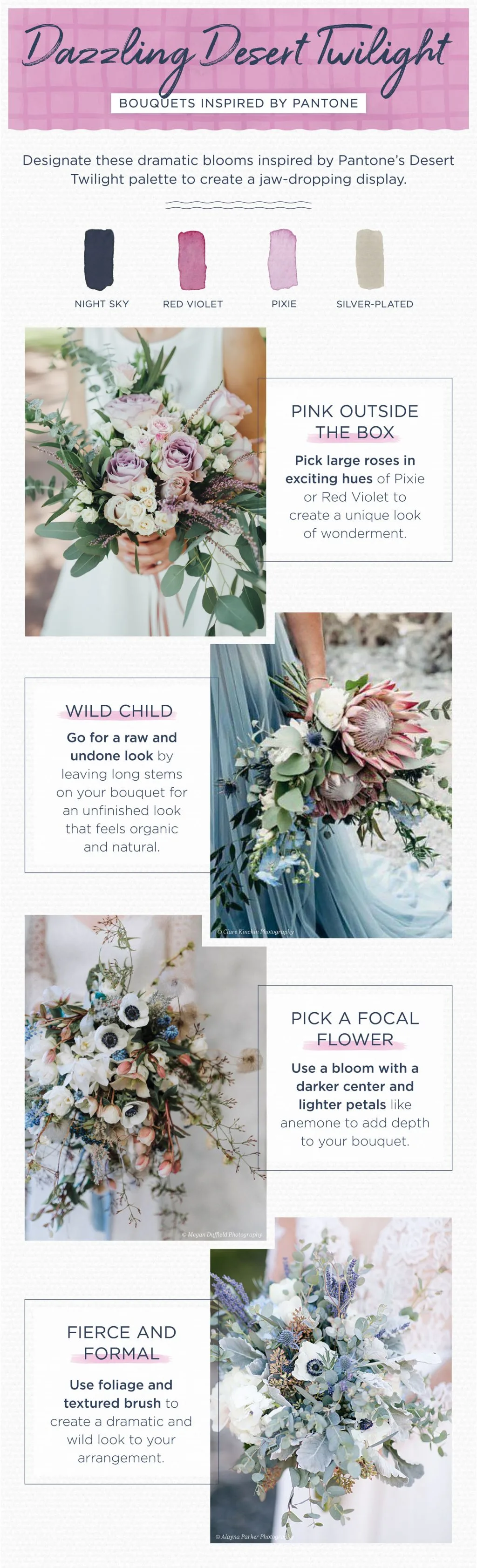
Clare Kinchen Photography | Megan Duffield Photography | Alayna Parker | Marion Flower Shop
Harvest Healthy Hues
While the color harmony Exotic Tastes may sound bold and foreign these colors were actually selected to be tied to food, vitamins, and over wellness. Blue foods are known to contain anthocyanins which in relation to health helps to build a solid foundation, acting as a form of protection for good health.
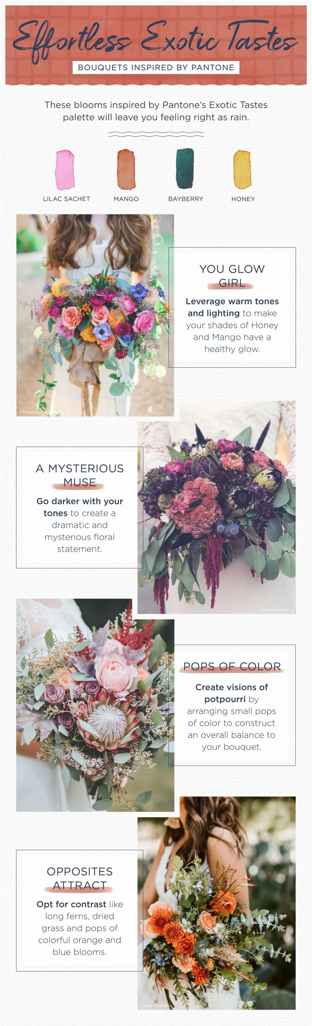
Pinkerton Photo | @sarahsgardenstyle | Victoria Gold Photography
Celebrate the new decade by bringing tranquility and meditative energy into your home, office or work space! Incorporate Classic Blue into your favorite floral arrangements and experience the different senses and emotions Pantone crafted with each color harmony! For more inspiration see all of our florals categorized by color to create different bouquets using Classic Blue all year long.